The Legacy of Urban Renewal in New York City
New York City, New York, USA
By Jakob Winkler
urban renewal, redlining, public housing, foreclosures, vacant land, race
My project interrogates the ongoing impact of urban renewal policies on the population and geography of New York City.
My final project is related to my thesis in which I am looking at the legacy of urban renewal in New York City and the ongoing impact this policy has on the communities and geography of the city. My maps are aiming to critically investigate the history and present application of urban renewal in the city, its relationship with redlining and institutionalised racism in the built environment, its impact on the social form of the city, as well as the ongoing use of it in 21st century New York City.
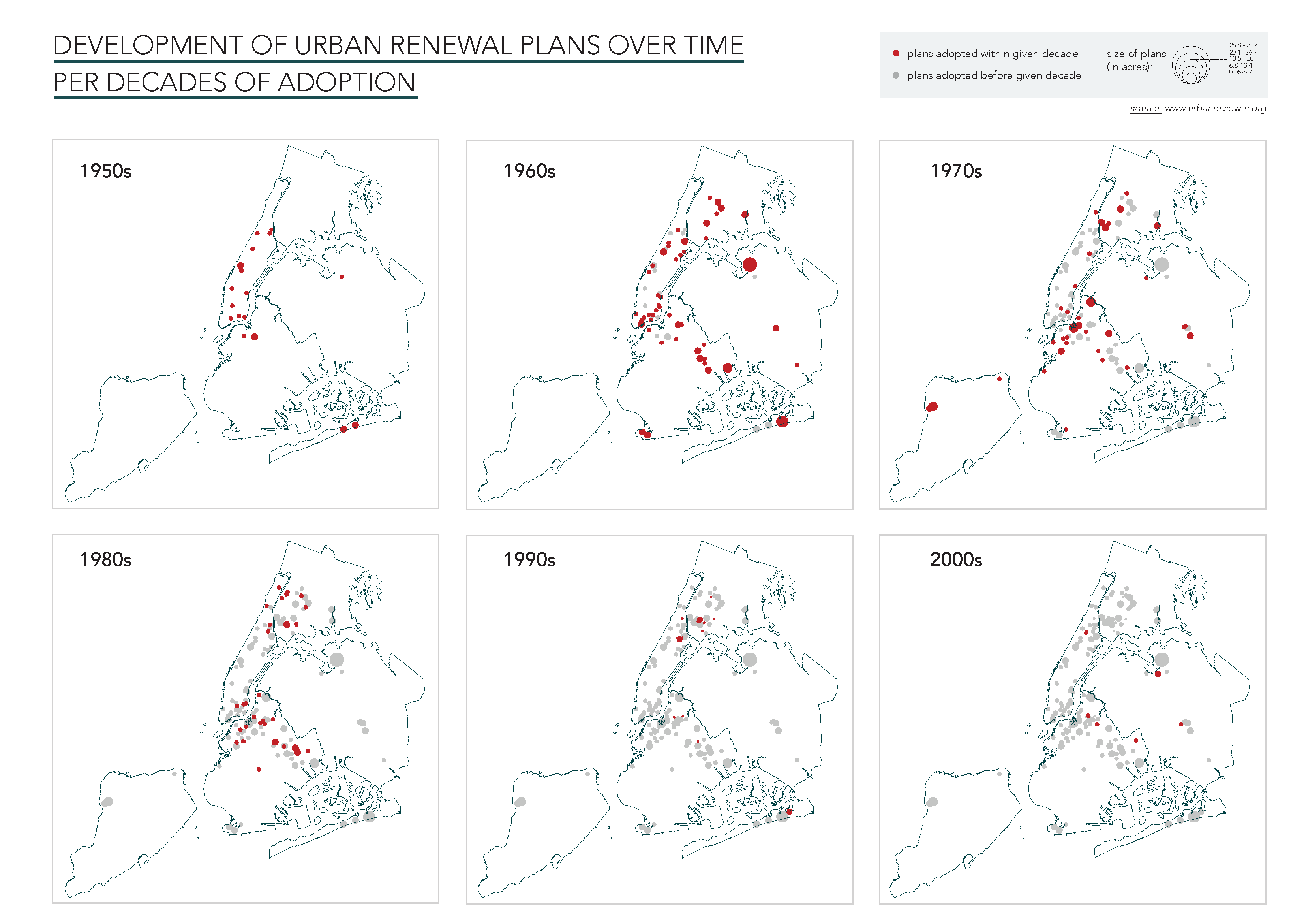
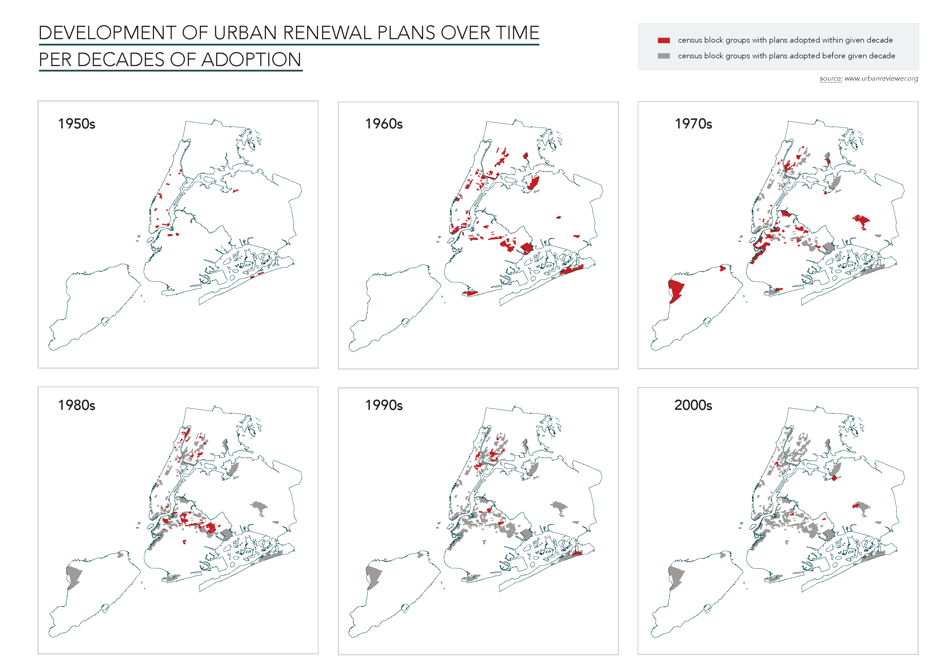
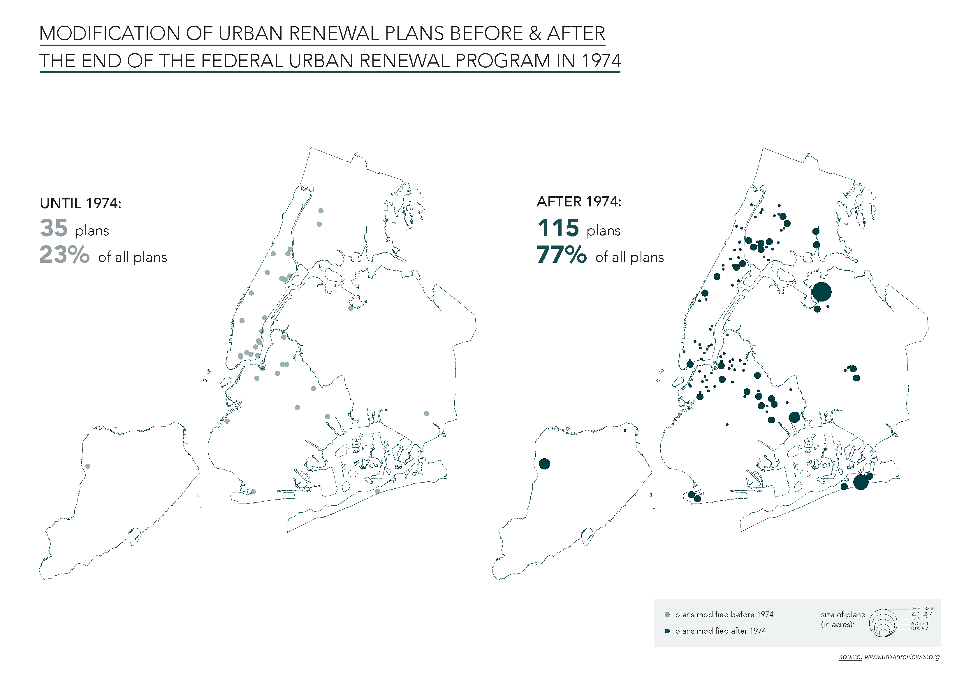
The first series of maps looks at the evolution of urban renewal over time. Using data from the Urban Reviewer, I tried to how, unlike suggested by public and even academic discourse, urban renewal has not ended after the end of the federal program in 1974, but instead continued on the basis of state and municipal law.
The first two maps show the adoption of urban renewal plans over time, first in points which reflect the size of the plans in acres, and second aggregated to the census block groups in which they are located.
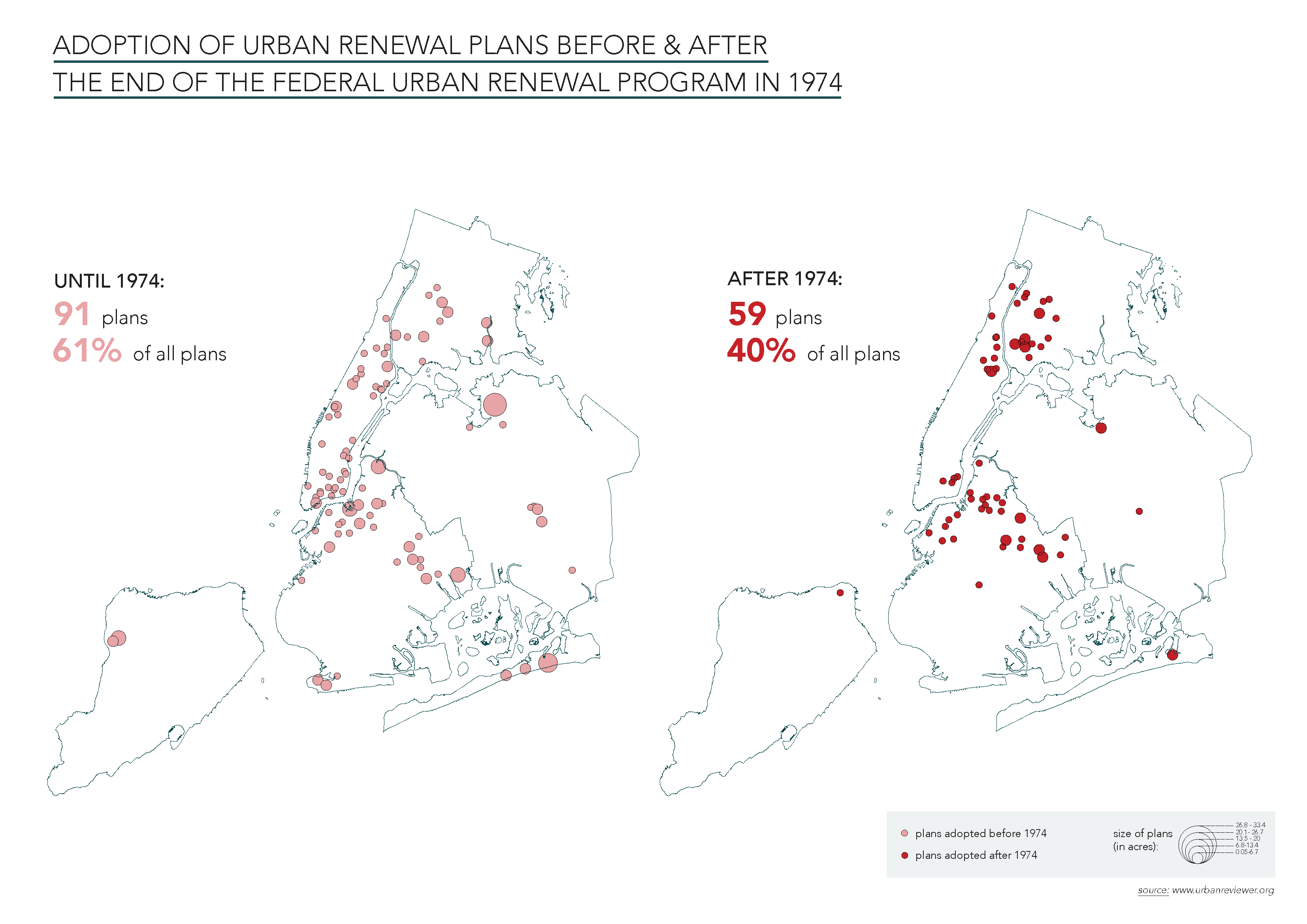
To highlight the argument that urban renewal has not ended after federal funding was cut in 1974, I made two additional maps that compare the plans adopted and modified until 1974 and after 1974. 40% of all plans ever adopted by the city were adopted after 1974, and 77% of all plans were last modified after 1974, showing that there is activity within already existing plans years after their adoption.
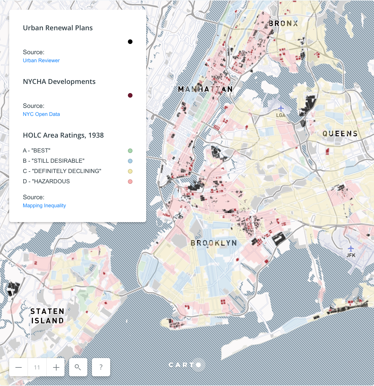
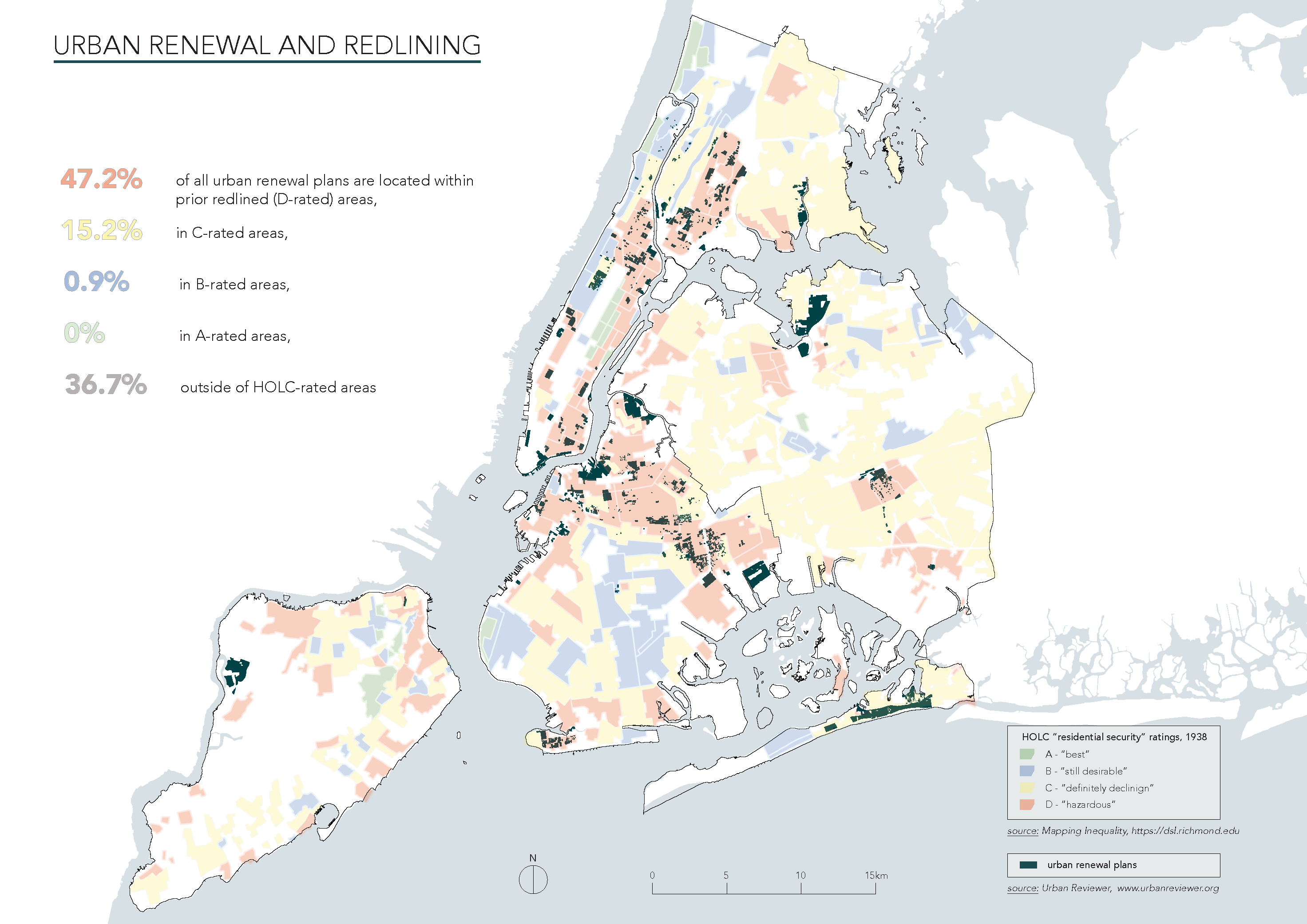
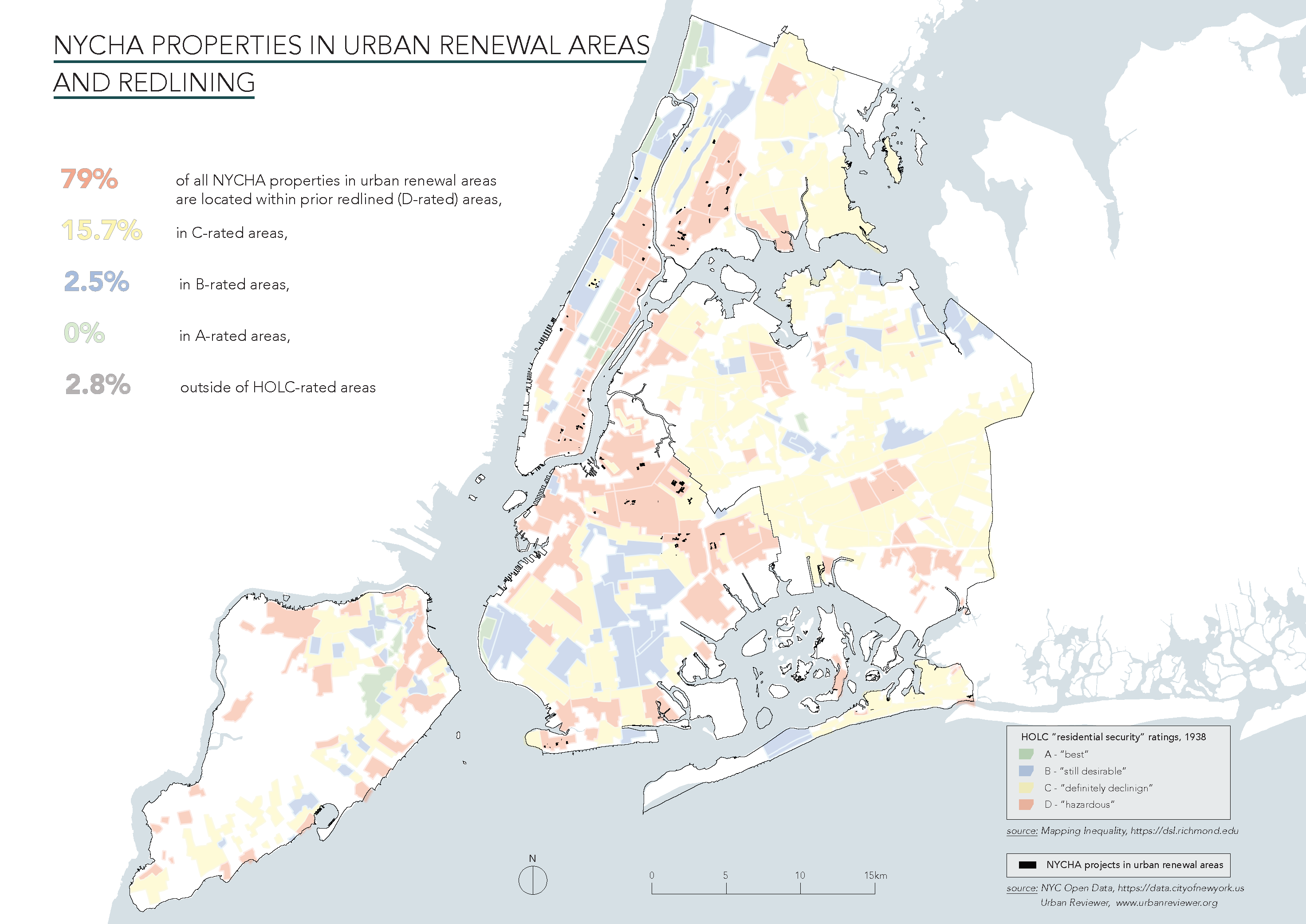
The second series of maps looks at the relationship between urban renewal, redlining, and public housing construction. Data on urban renewal plans is again derived from the Urban Reviewer, the data on redlining from the Mapping Inequality Project, and data on NYCHA projects from NYCs Open Data portal. The maps show that both urban renewal and public housing construction focused heavily on areas that have prior been redlined. Almost 50% of all urban renewal plans and 70% of all public housing projects in NYC are located in prior redlined areas. This overlap shows how the “blight” produced proactively by redlining, among other private and public practices and policies of disinvestment, was later as a legitimization to bulldoze these same areas. Public housing, too, concentrated in disinvested neighborhoods, concentrating low-income populations in smaller and denser areas of the city.

The third map shows the overlap of NYCHA projects within urban renewal projects with redlining. It becomes obvious how a) only very little public housing was built through urban renewal (an interesting fact given that the “public purpose” and provision of public housing was used as a major legitimization for urban renewal), and b) the NYCHA projects built within urban renewal plans are even more concentrated in prior redlined areas (80%).
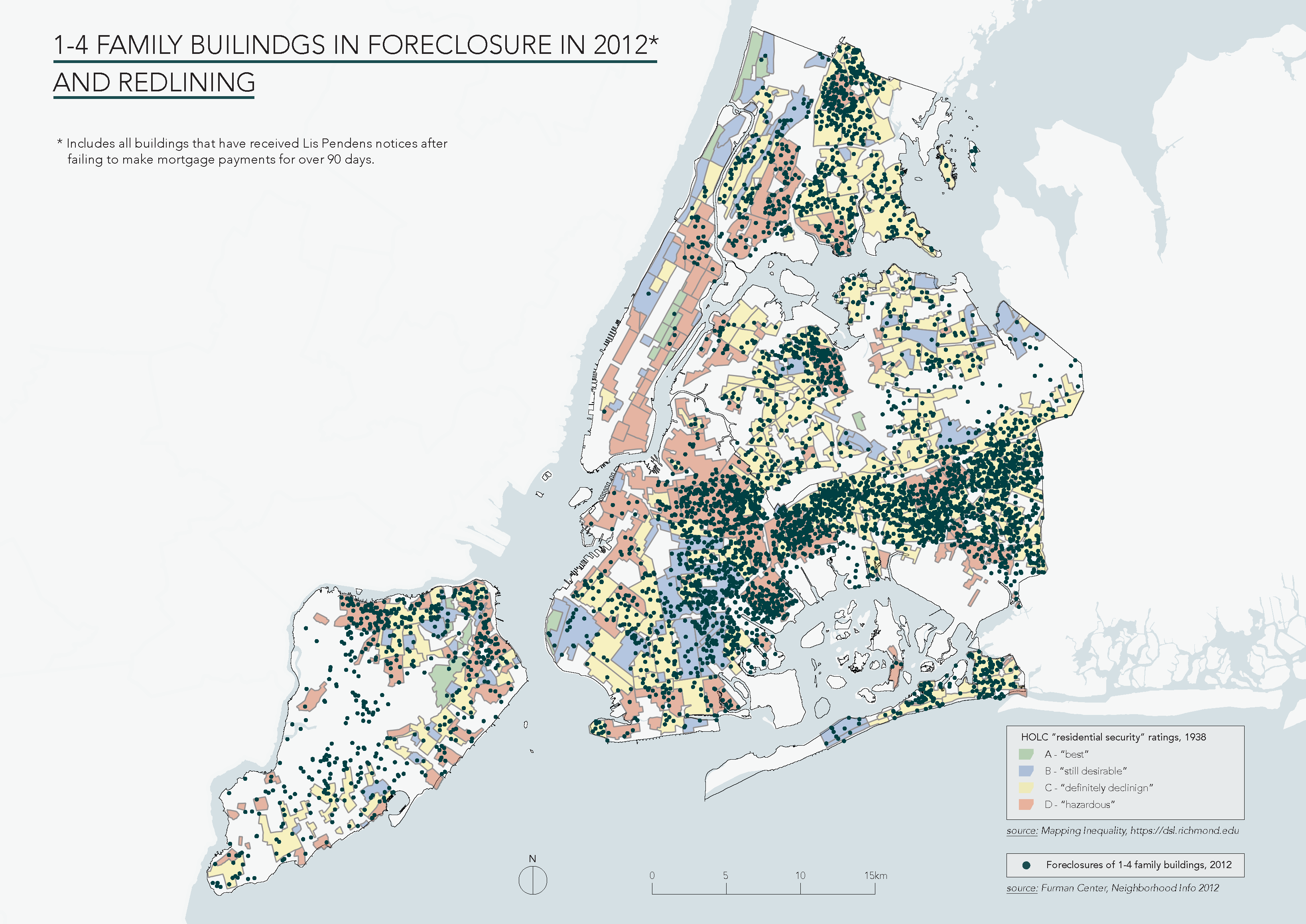
The last map of this series shows the relationship of redlining with the current foreclosure crisis, making visible the impact of subprime mortgage lending practices in these prior neglected neighborhoods. Foreclosure data is derived from Furman Center’s Neighborhood Information.
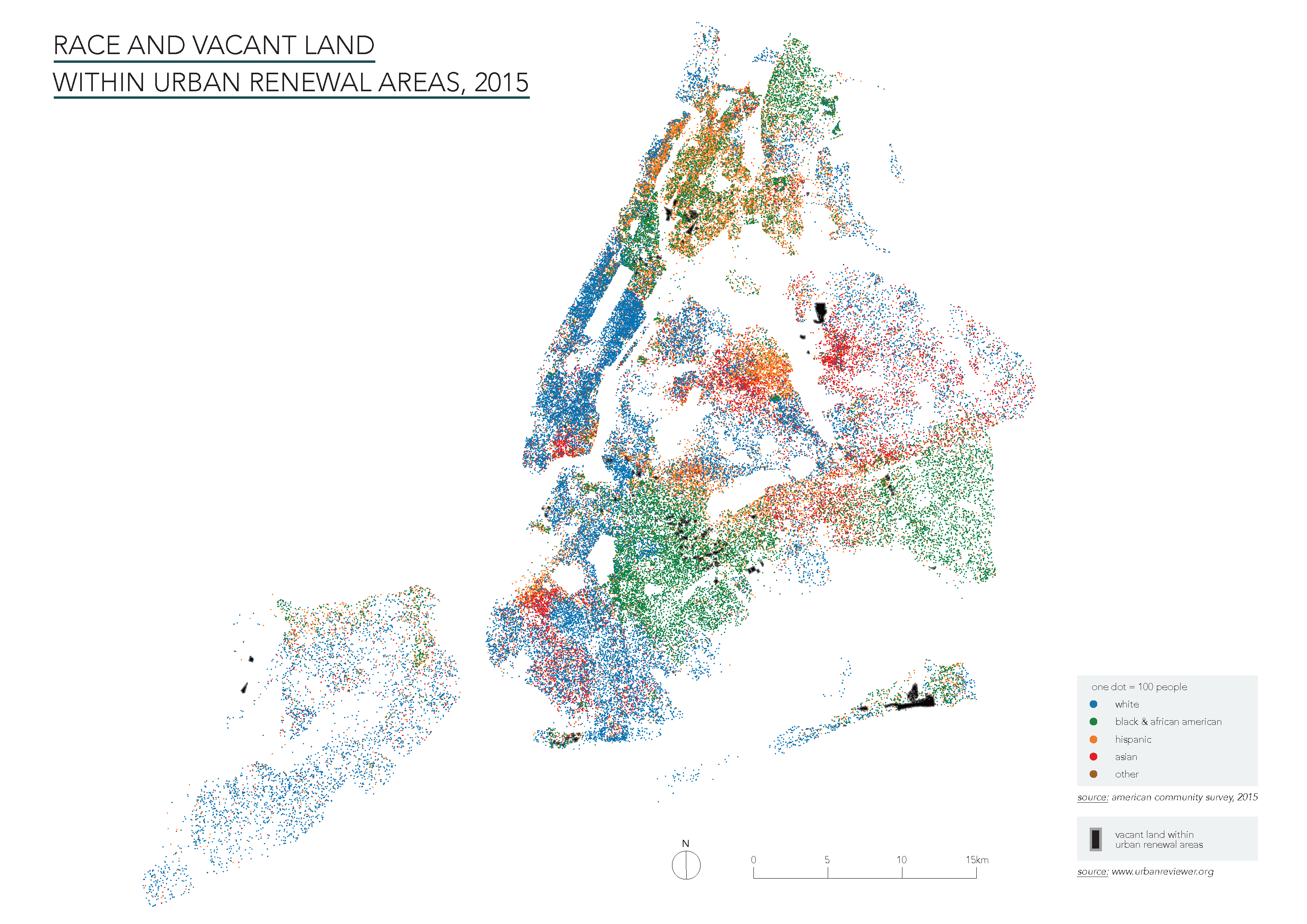
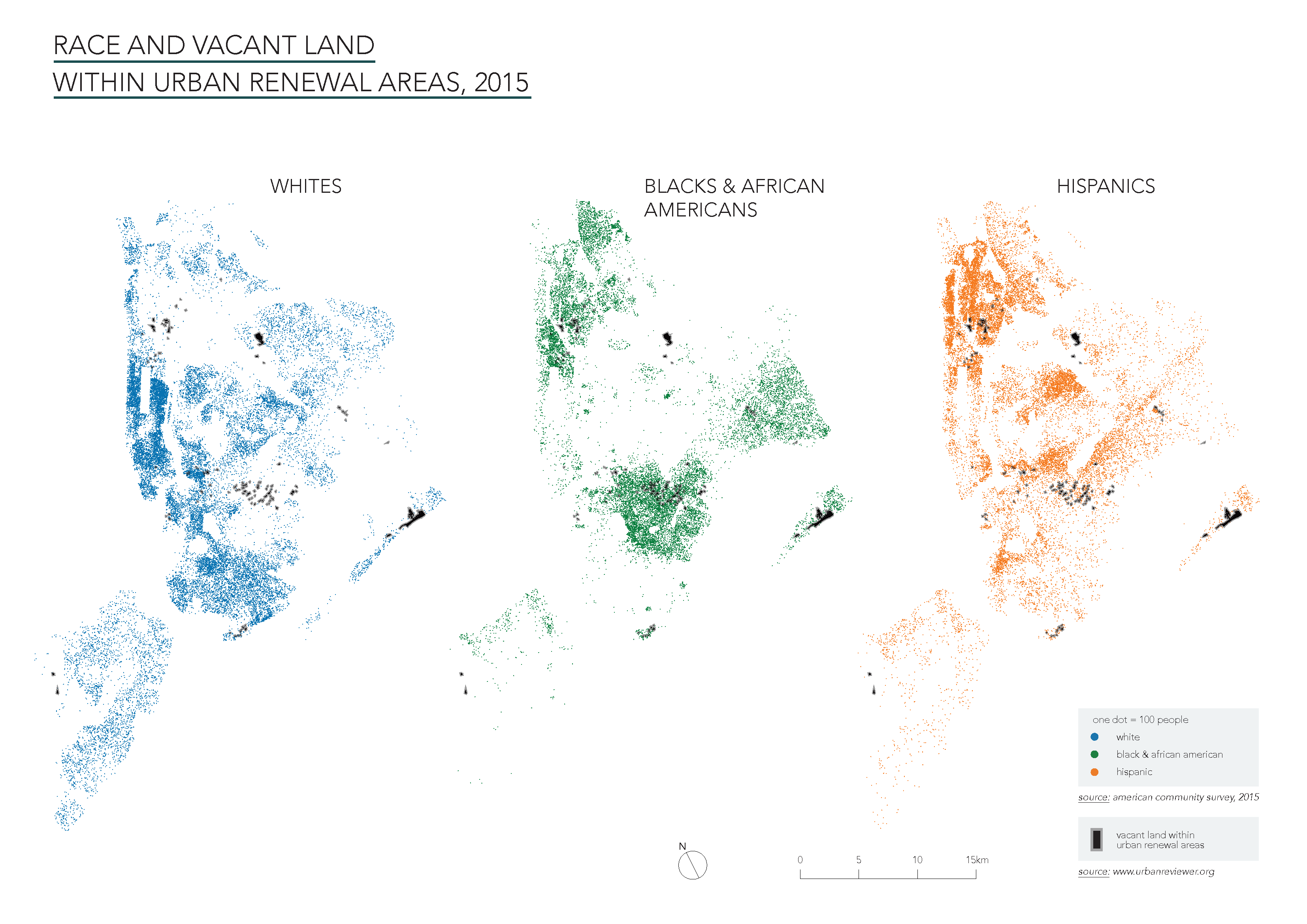
The last two maps explore the relationship between city-owned vacant land within urban renewal plans today with a race dot map using the latest available data from the American Community Survey in 2014. The map reveals a strong relationship between minority populations and still unused land within urban renewal areas, showing the ongoing public disinvestment in communities of color as well as the uneven distribution of negative effects of urban renewal along racialized and ethnic lines.
I finally created two maps on Carto that layer the data sets described above and show the relationship between urban renewal, redlining, and public housing construction, as well as the impact of these policies on patterns of racial residential segregation in the city.
The second online map shows the relationship between the government practice of redlining, the racial and ethnic composition of neighborhoods, and current rates of foreclosures.